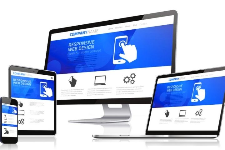
Responsive web design was the trend that was started back in 2010. This concept became so popular that many software enthusiasts wrote books on this topic. Our notions about web design changed dramatically by introducing fluid grids, flexible images, and media queries. Thus, ever since the introduction of responsive web design, we have been resizing our browser Windows. Initially, responsive web design started as an industry trend, but slowly it grew to become one of the most popular topics of the present industry.
RWD is now becoming the norm in the Software Development Industry. Every developer has to adapt their techniques with this new trend of the software market. In this article, we will discuss the five rules that every developer should follow while creating responsive web designs. We strongly believe that these are the areas where the developers need to adapt to the responsive web.
Design with Real Content
There are various situations when designers create a module within a website, and eventually, the beautiful design gets tarnished. The main reason behind this is a delay in content by the client or copywriter. So, this problem would be easily solved if there was a way to have the side content upfront. Before starting any project, there must be a content strategy for every company. As a developer, you need to have a good idea about the final thoughts before creating it or developing any new features for it. As we all know, it is entirely useless to build or design anything if there is no clarity about the application or software goals.
Once you get the content for the website, you can start developing the content reference wireframes. In simple terms, content reference wireframes are rectangular blocks to form a layout of website content. This process will help to reference and position every piece of content precisely on the particular web page. So, significant companies use this technique as an ideal form to show the basic layout of the main templates. For instance, you can use this method to show the location of the navigation, sub-navigation, future navigation, and secondary module for the main body of the page. Thus, you are designing the framework for which you will later create the details.
Now, this is a perfect time to consider the breakpoints for responsive web designing. For instance, if you understand the content strategy, you can create a one-column layout for every mobile device. The industry uses this strategy to create basic HTML web applications. Finally, after you complete making the order of information, increase the width of your Canvas alignment until it is perfect. This entire process will prove to be your first breakpoint into responsive web designing.
Design “In-Browser.”
As a developer, you also must consider abolishing flat visuals and Photoshop compilation for responsive web design. For instance, these practices confuse the development process as it creates a view of the website functioning based on various devices. In contrast, the actual functioning is different from the predicted data. For instance, the spacing between elements in which the font is rendered and the image’s quality varies in the final output. In simple terms, the main problem with the visuals is that they are too good to be true. The image qualities are crisper and smoother; drop shadows and blend modes with the design make it look like a piece of art. As a company, ensure that you lower the client expectations before you sign the deal.
You can accomplish this goal by building a responsive prototype using languages like HTML and CSS. Additionally, many new tools can help you to create responsive prototypes. In case your abilities with development are limited, you can ask a developer from your company to help you with this project. However, we strongly recommend all designers to learn at least the basics of responsive prototypes to understand how their beautiful designs are built.
A significant benefit of this process is that it helps you to reduce the time to make changes. For instance, by defining a CSS class, you can make all updates at once, across all your web pages. This process helps the company to benefit in the long run. Moreover, this process allows you to export your designs on a real mobile browser to experience the actual visuals.
Develop A Pattern Library
The style guide is one of the key outputs to a successful, responsive web designing project. Using this process, you can include styles for the entire project and interactive states of these modules. Additionally, it also has a bit of a responsive framework. However, a pattern library is a new breed of this beast growing in the software market.
Developing a pattern library allows you to define a pattern that will be used throughout your website. Thus, you can reveal the notes and codes referred to along the way of the development process. Additionally, for a responsive web design, you have to illustrate the process by which the module would adapt between the breakpoints that you defined. So, creating a pattern library is similar to the prototype creation process using HTML and CSS.
To create the pattern library, you can begin with the brand styles that you applied to the HTML elements. Thus, you will form a typical pattern using these elements and continue the process. The pattern library will tell the entire story of your project, describing how you have taken the client’s brand and created an online presence for it. Additionally, the option to include the course and code snippets along the designing process allows the developers to access the designing information. This process will also help the client to understand your design.
Thus, the pattern library is one of the fastest-growing vital points for responsive web designs. So, we can state that our shift from designing pages to designing system components is one of the primary reasons for the pattern library’s growth.
Make It Universally Usable
The most important thing about designing a responsive web page is that you cannot predict every customer’s user experience. Additionally, this process becomes more difficult for mobile devices—for instance, hundreds of different possible scenarios of how a customer would be using your web application. However, you can predict the exact number with the help of the number of Smartphones and Tablets that are currently operational in the market. Moreover, you also have to consider the differences in screen sizes, resolution, and input types.
Thus, your design needs to be wholly Universal and adaptive to its surroundings. Let us take a look at some of the hints that can help you with this process:
- The Rule of Thumb
In this modern age, a lot of mobile devices are touch screens. So, you must be aware of the size of the interactive elements within your system interface. Many companies develop slightly large hit areas for creating uniform mobile and desktop experience.
- Navigation
Navigation is one of the immense challenges of creating a responsive web design. There are quite a few things that you can do to handle this issue. Additionally, the method’s complication will depend on the number of breakpoints that you introduce in the application.
- Mobile Layouts that are Task-Oriented
It is another essential consideration to create a successful, responsive web design. You must ensure that you surface the critical calls that are on the webpage. Additionally, it has been widely discussed that fold is absent in almost all web pages. So, it would be best to determine a safe zone depending on the smallest viewport size.
Keep Performance In Mind
Neither is it possible to predict the user mentality and device for all your customers nor can you presume the quality of the internet connection or browser responsiveness. Thus, you need to design the responsiveness of your webpage while considering performance as your highest priority.
As we all know, no one likes to wait on the internet for a web page to finish loading. For instance, a survey suggests that 80% of internet users expect pages to load within 2 seconds, irrespective of the device. So, it is easy to justify that if your web page fails to meet this expectation, you will lose lots of users. The process of performance improvement and web page reliability helps to increase user trust and loyalty.
So, to ensure user retention, you have to develop a light webpage with simple navigation controls. A study suggests that over 60% of every web page’s file size consists of images and other illustrative features. So, you can export the photos to your external graphical application to reduce the web page’s size. Moreover, various websites help you reduce the resolution and file size for your web applications’ images.
- Test on LambdaTest Browser
LambdaTest LT browser is one of the most popular applications for Web application testing. To ensure that the application is working correctly, you need to test its responsiveness with a testing tool. LambdaTest allows you to test web applications on over 2,000 Browsers and hundreds of real devices. Their wisely priced plans ensure that every company can afford its fruitful services. Thus, we recommend that every company explore LambdaTest Browser as the ultimate tool for responsive web designing. Their innovative features and best customer support have been serving the software industry for several years now.
The Verdict
We can conclude that the days are gone when the designers needed to worry about the juxtaposition of the content colours and typography styles on all web pages. The software industry has evolved beyond web designers, only filling in a detailed wireframe within a typical waterfall-style project. Now the designers need to understand how the sites are built. Additionally, they have to understand the process to prioritize the content according to the users. So, the only way to learn all this is to start your research and keep practising these new web designing trends. The industry is currently struggling to keep up with all the new web-enabled devices that are being released every day. So, as a designer, you must find out new areas to learn about responsive web designing.
Thus, it is time to widen our viewpoint and learn more features about web designing. This process will help to uplift our User experience. As a Company, your motto should be to make the web a better place on every device.


![TamilRockers Proxy 11 Mirror-Sites [Updated 2022] & How to Unblock It](https://www.techsplashers.com/wp-content/uploads/2022/01/TamilRockers-Proxy-11-Mirror-Sites-Updated-2022-How-to-Unblock-It.jpg)
Leave a Reply